Fall Awards Book
- Creative Direction
- Art Direction
- Design
- Production
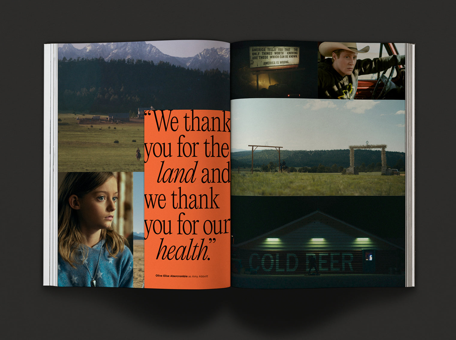
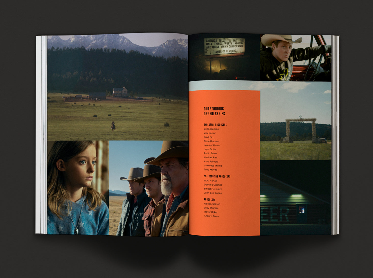
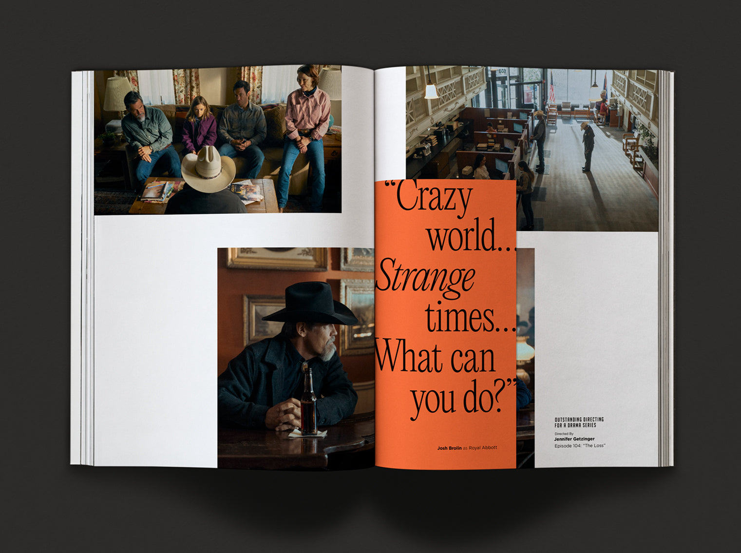
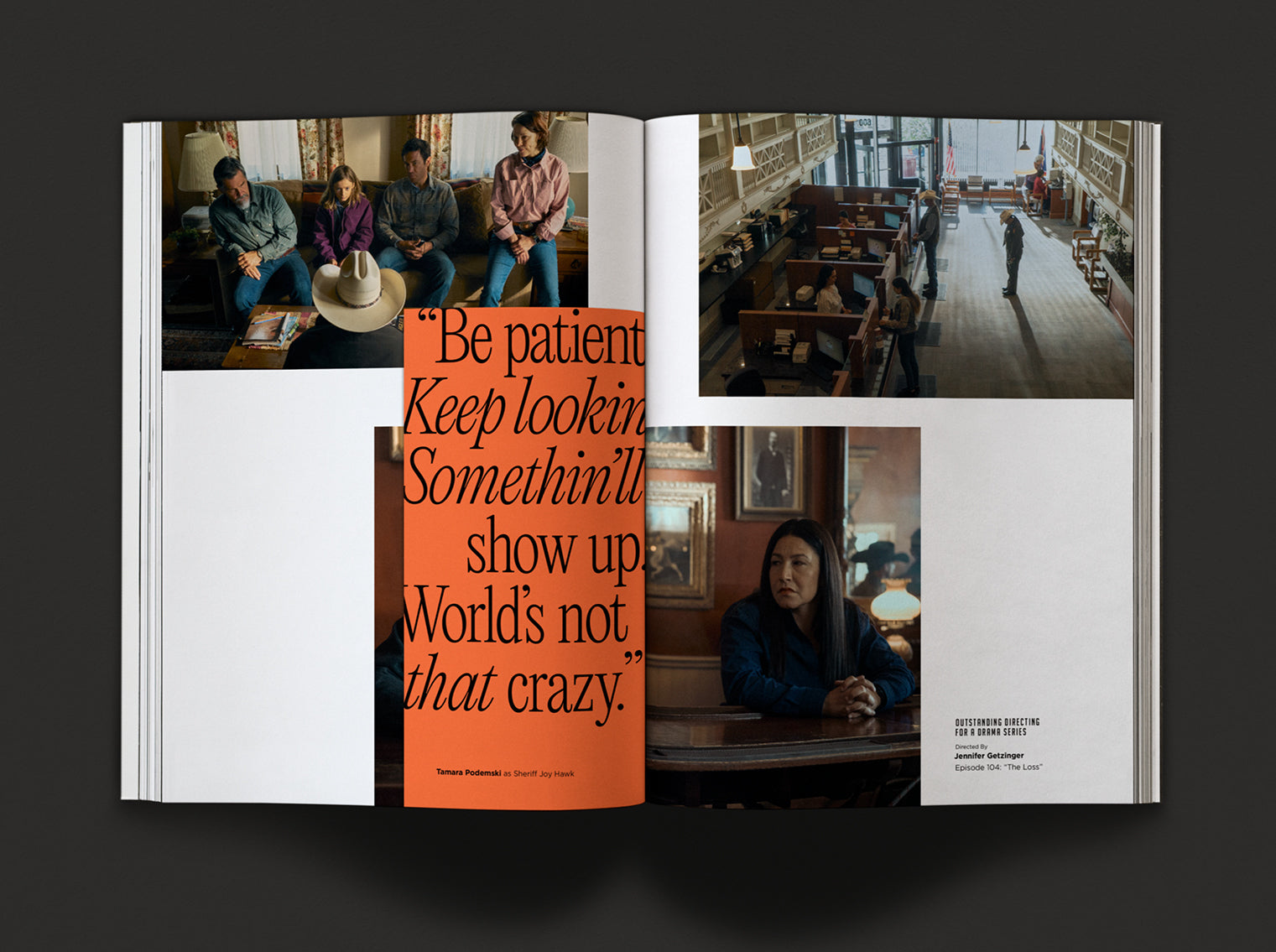
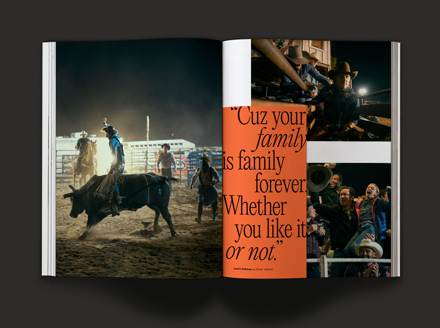
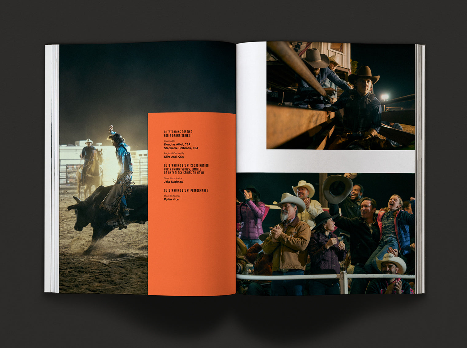
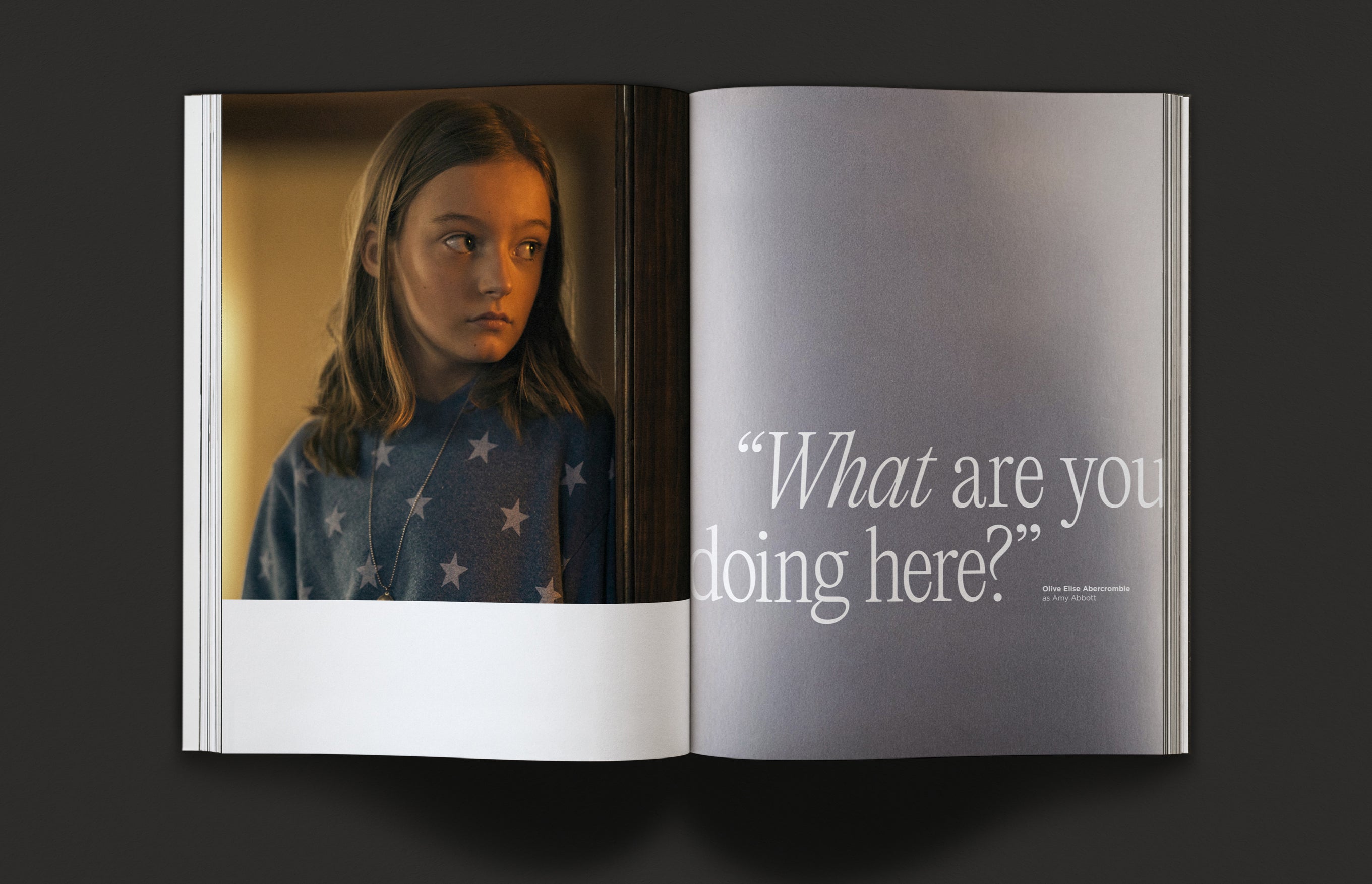
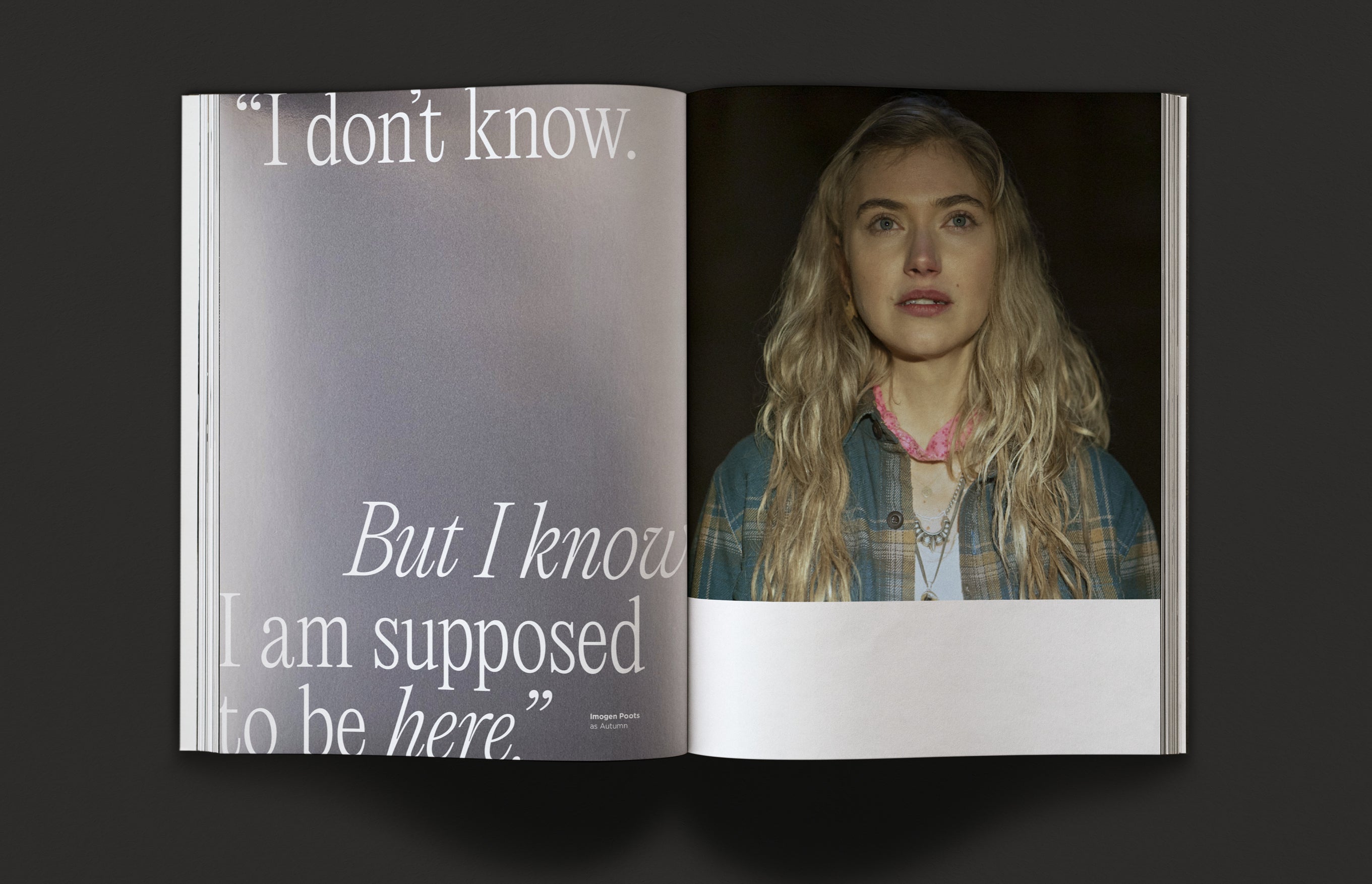
The series is mysterious and dark in tone and look — a Western myth about grappling with the unknown. It is a layered and complicated mystery, filled with symbolism and wry humor. The look we developed leaned into the dark, film noir vibe of the series, while weaving in symbolism and highlighting the talent. Throughout the book, we used various kinds of paper, symbolic color, powerful images, and impactful quotes to honor the tone, storytelling, and mystery of the series. The book was recyclable and printed using recycled materials.

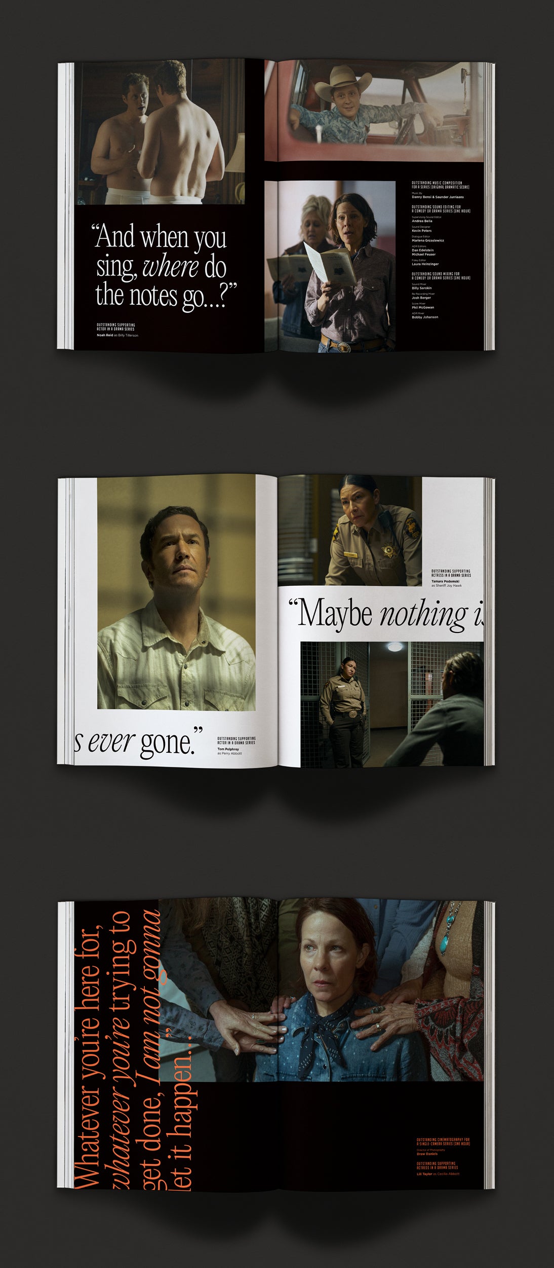
The design aesthetic we developed reflects the pacing and themes of the show. Outer Range is mysterious,
strange, and semi-cryptic chronologically. Because of this, we used typography in unconventional ways — for
instance, type starts on the right side, cuts off, and continues on the left. The layout of the photography
implies interruption and gaps in understanding.
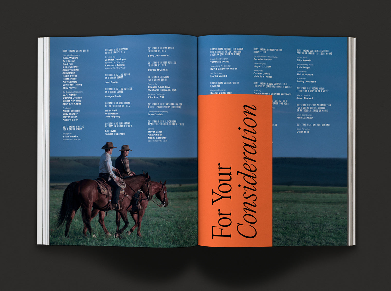
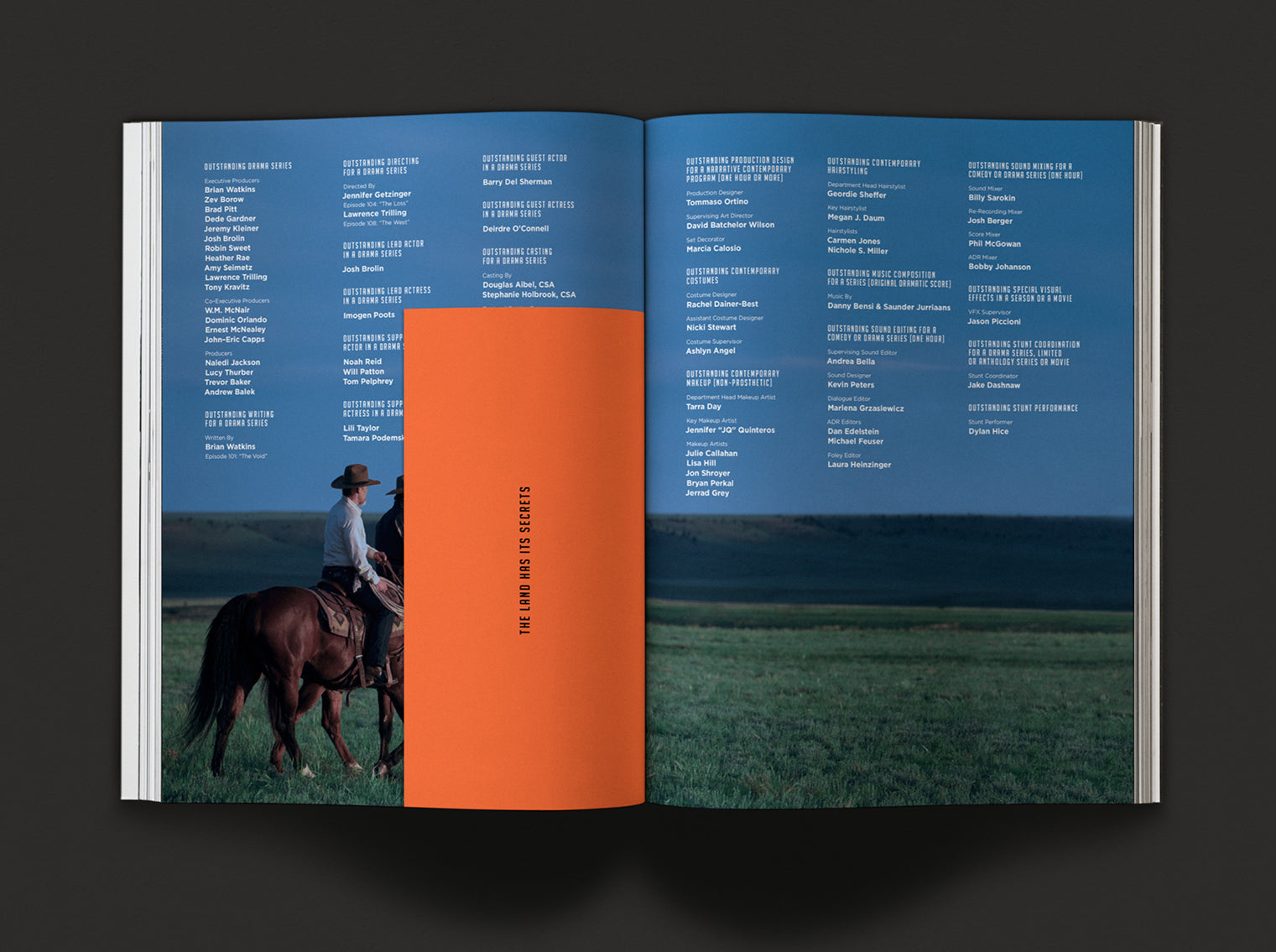
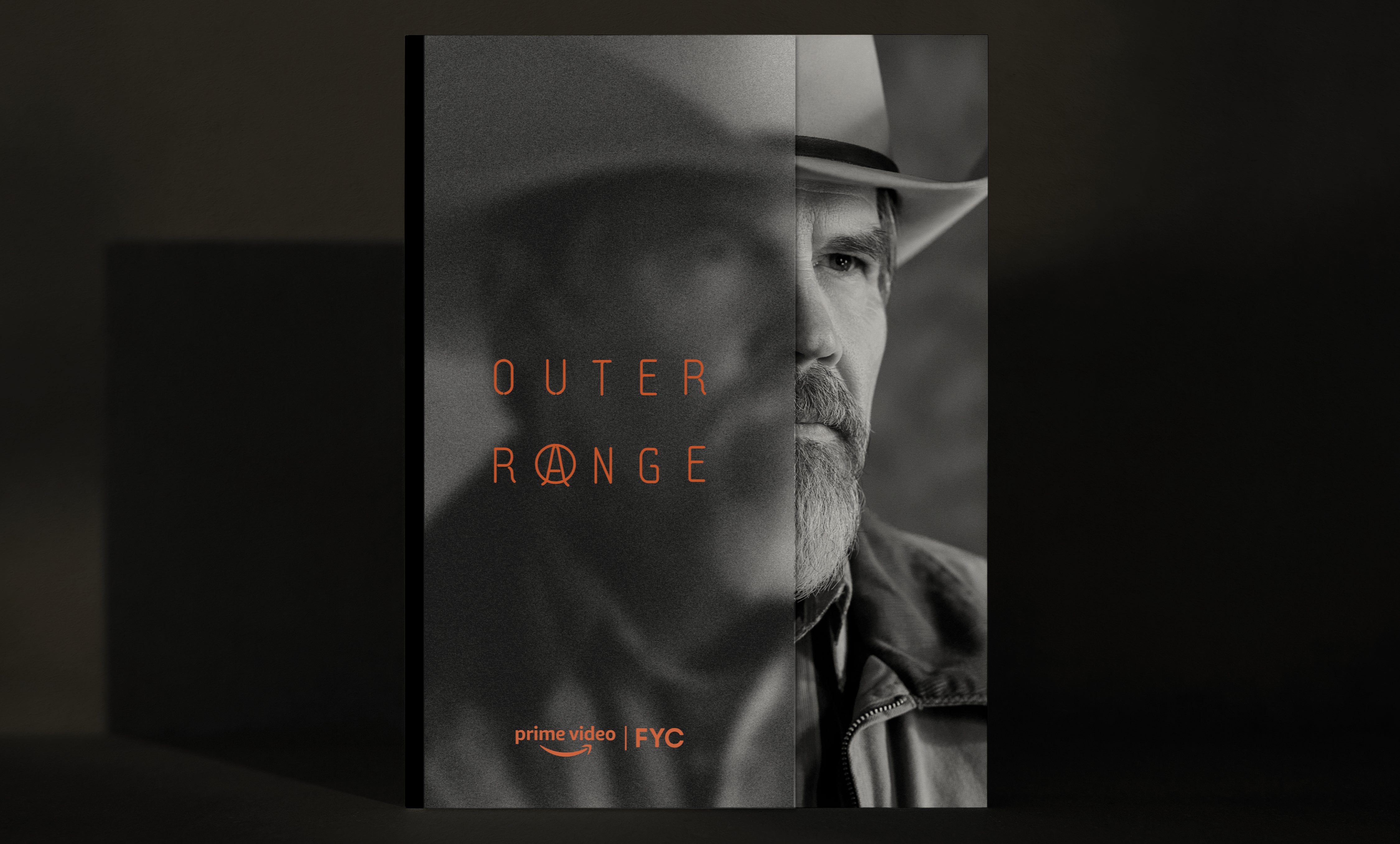
We also used methods of discovery, like mirror paper to hint at meaning and tip-in pages used as blocking
devices to obscure and then reveal information.
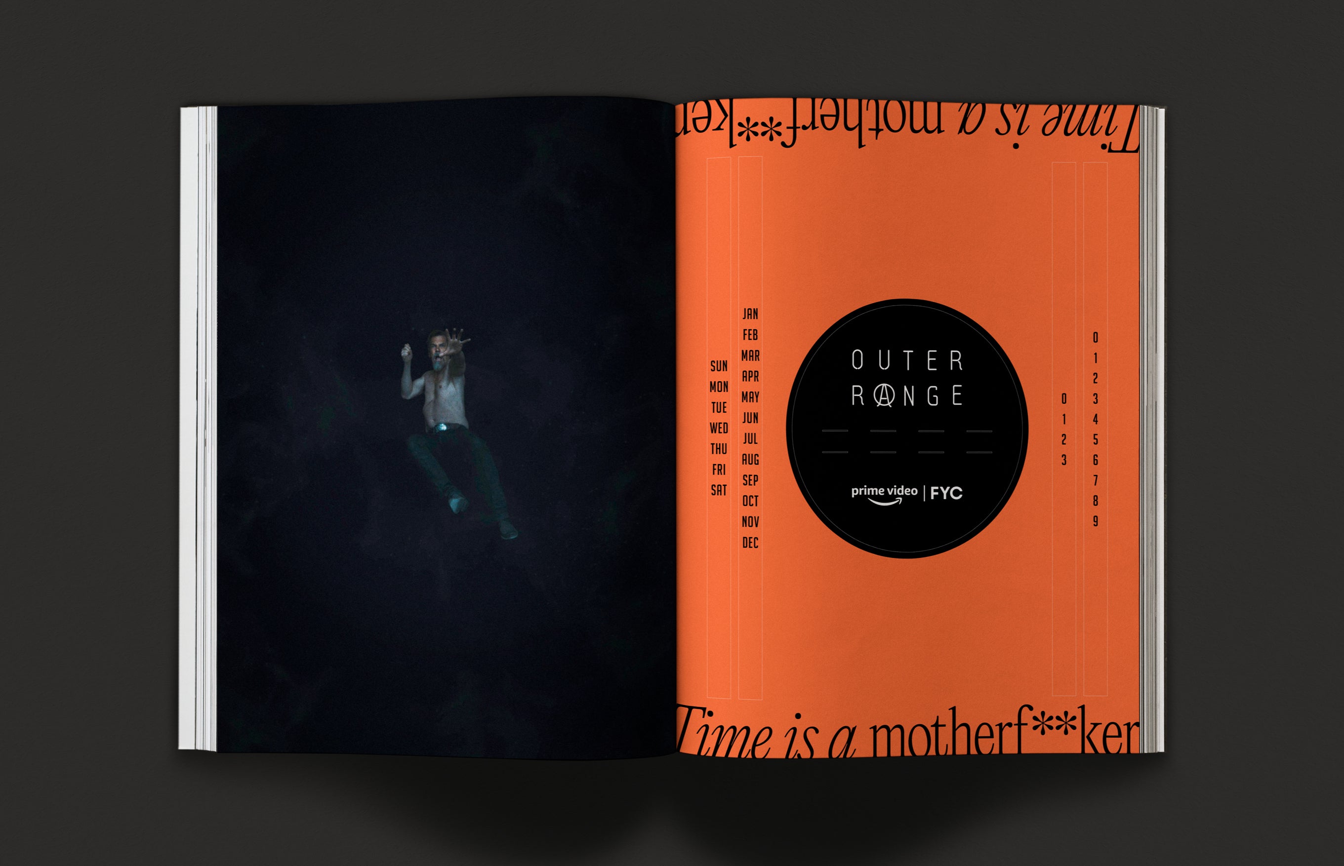
Neon pages and ink juxtaposed with the Wyoming western vibe represent the tension in the show between
tradition and the supernatural.
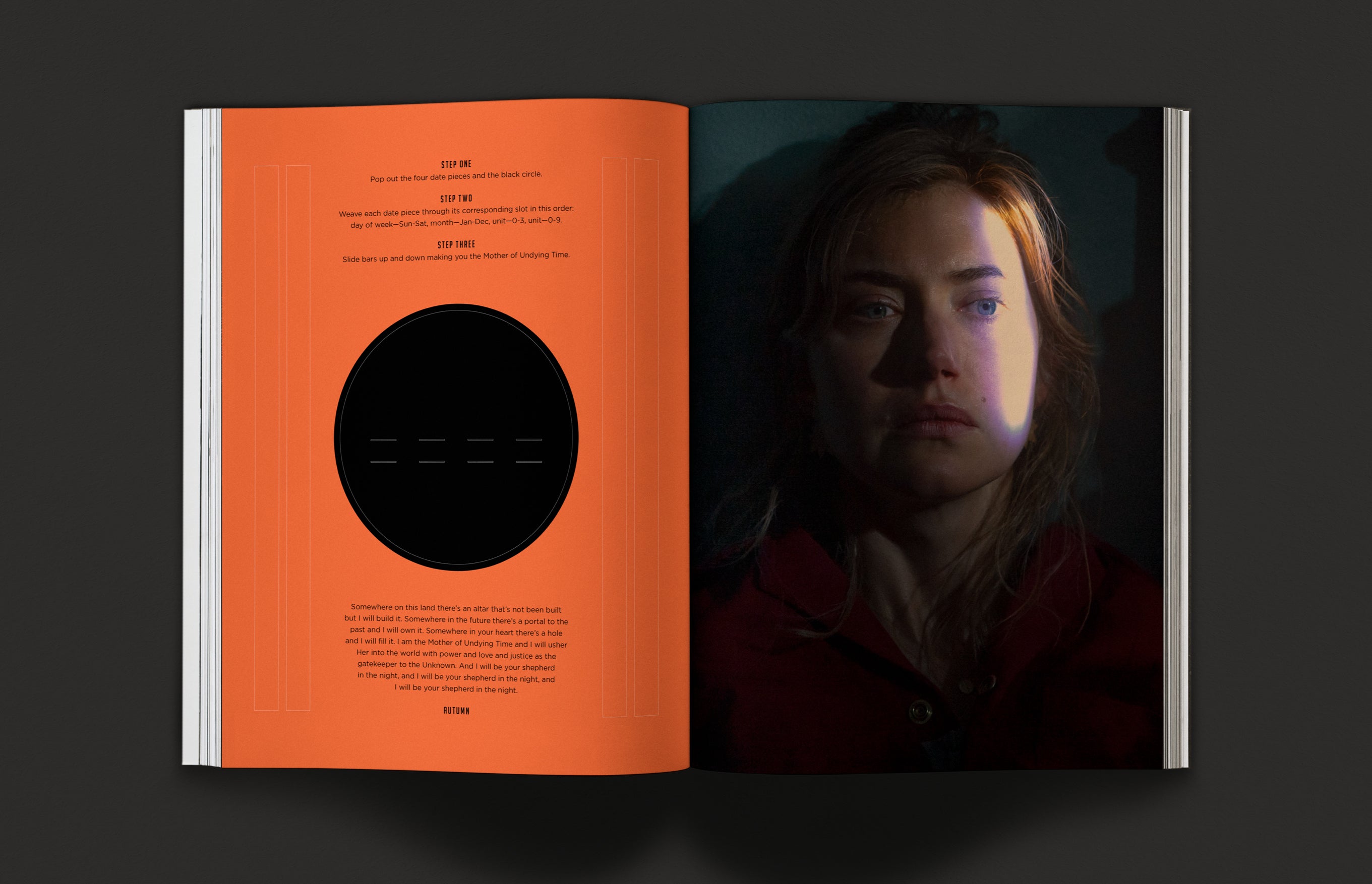
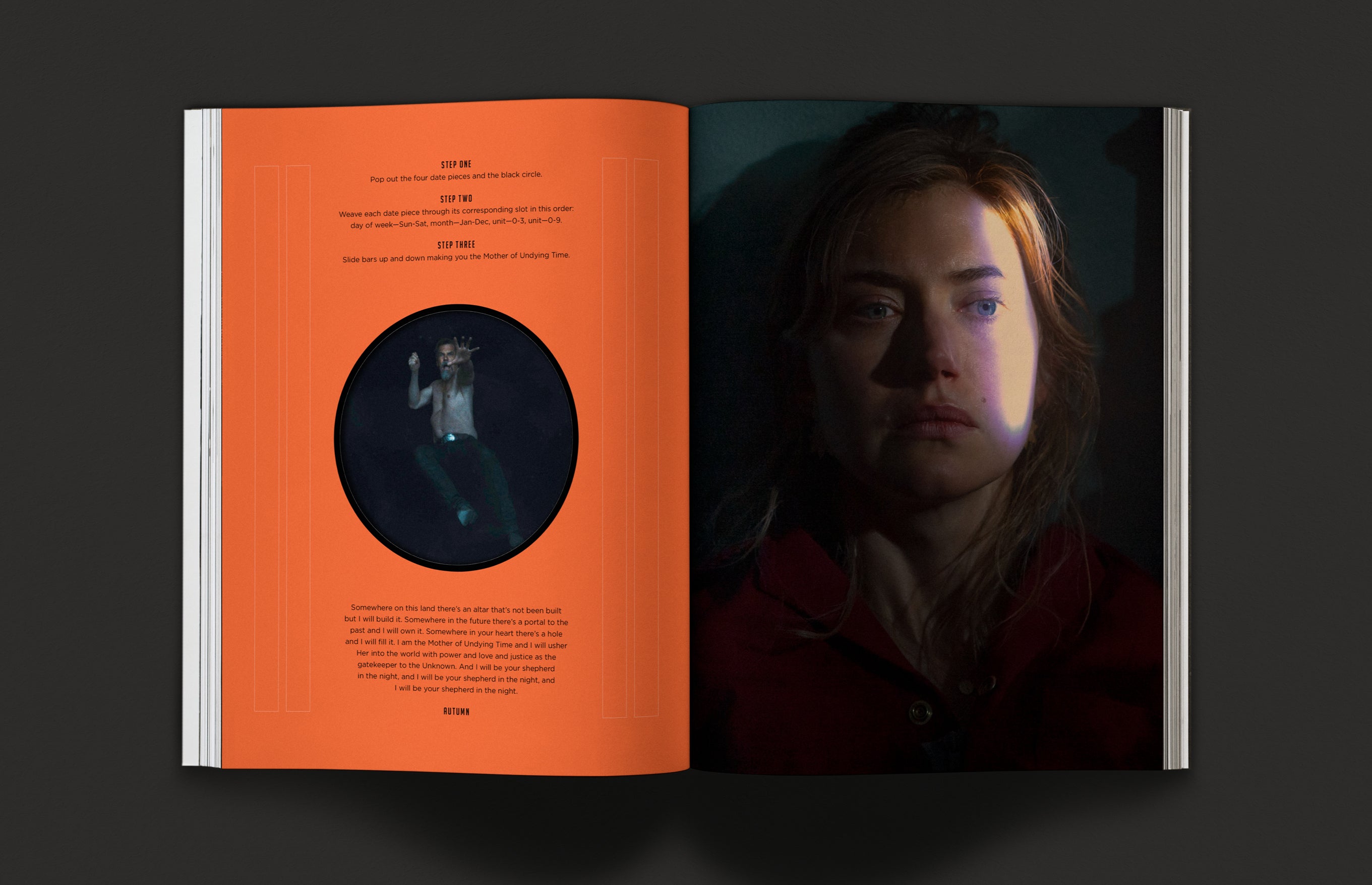
As a reference to time, the final spread of the book is a DIY perpetual calendar that is printed on cardstock and bound in. The viewer pops out the perforated shapes and puts them together. When removed, the hole reveals Royal Abbott (Josh Brolin) falling into the abyss.

